In this section you will find some time insights about Twitter usage in Switzerland
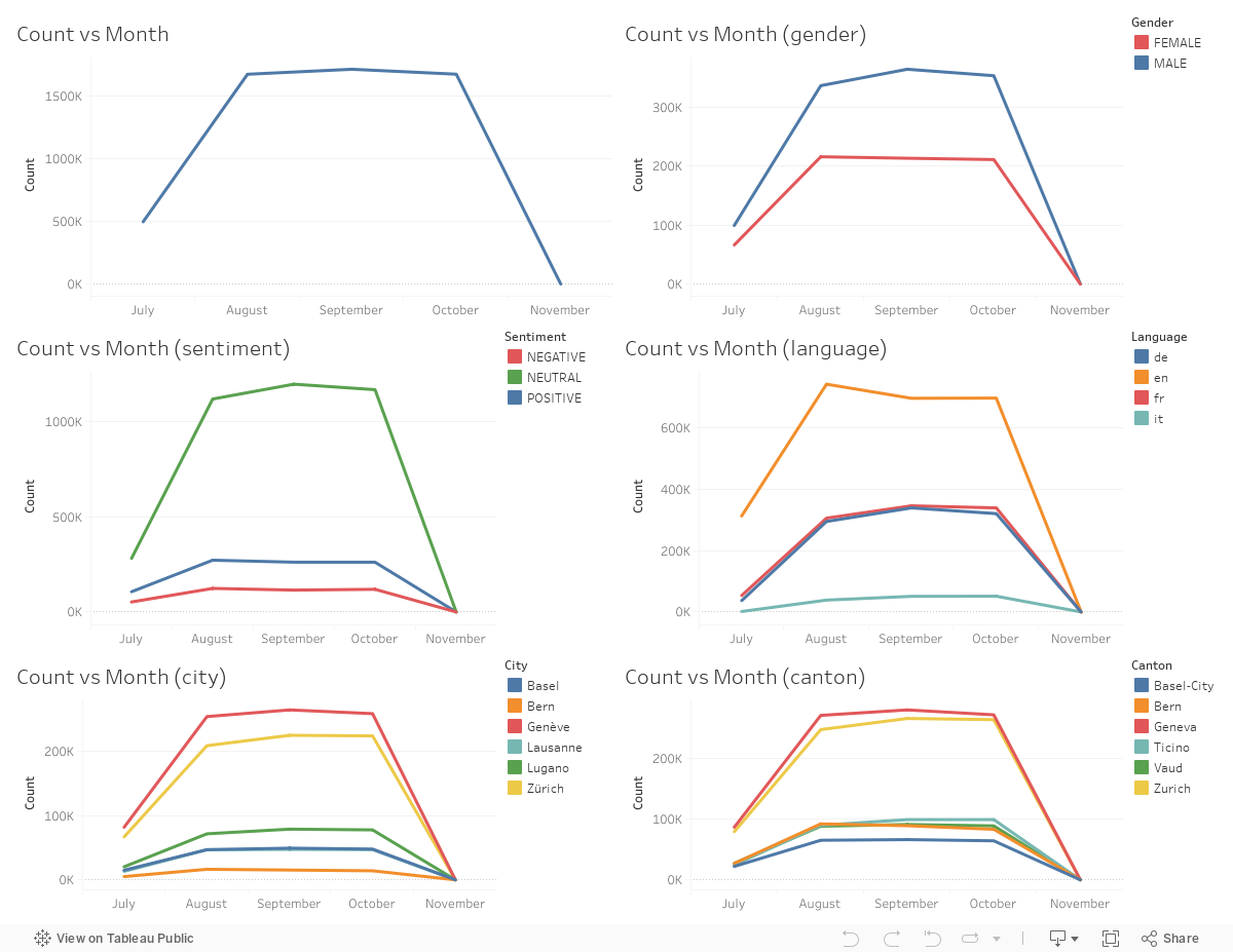
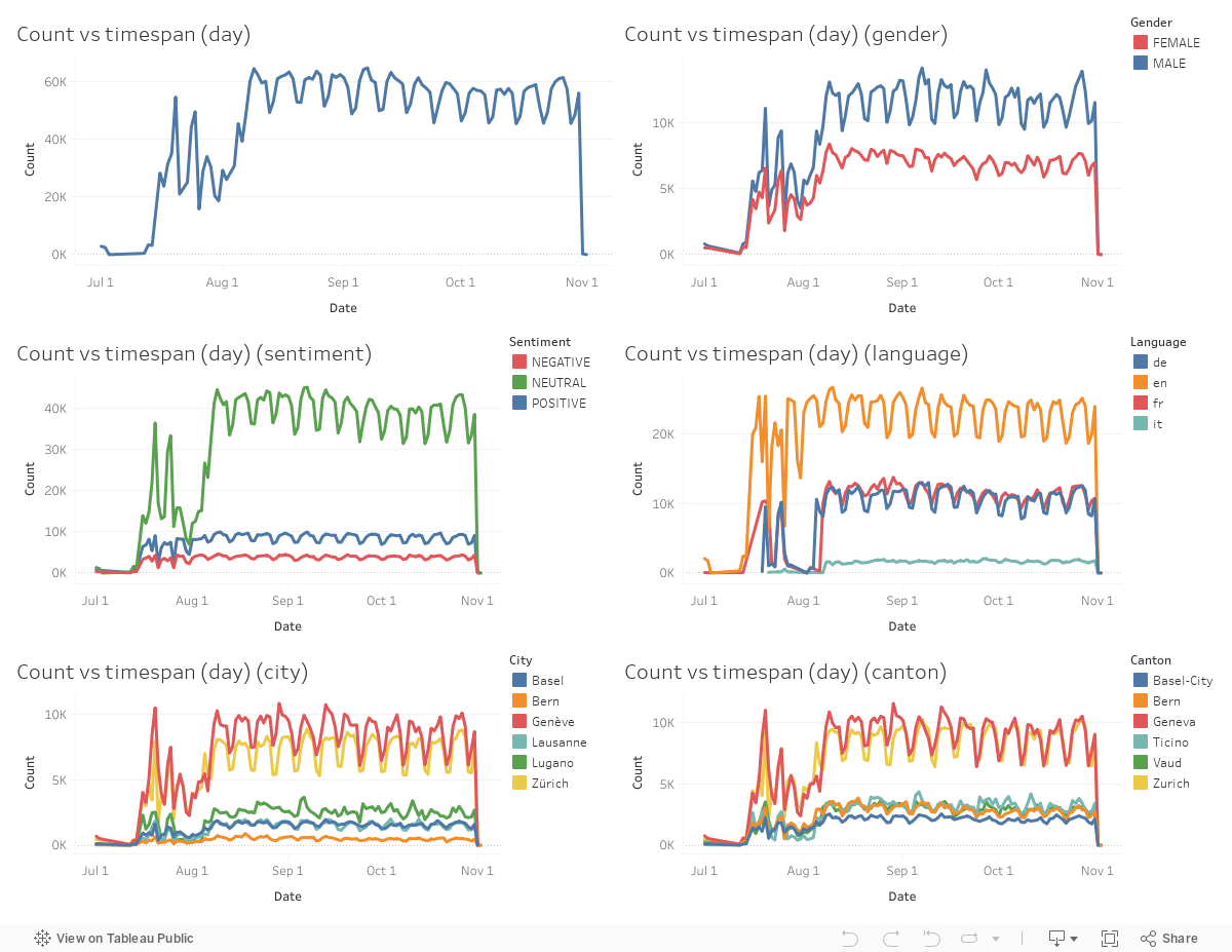
Tweets which does not contain location information are excluded, and remaining tweets are sent within 5 months; July, August, September, October or November of 2016. As it can be seen from the plot, number of tweets in July and November are far less than remaining 3 months, which might be the result of data acquisition process. If all of the tweets sent during whole of July and November are not collected when dataset is generated, then it is understandable that number of tweets for those months are lower. Note that, earliest and latest dates in the dataset are 1 July 2016 and 2 November 2016. Considering that there are less than 1.000 tweets during November makes sense as in November no tweets are acquired in a sense. During July, probably sampling process was different and only smaller portion of all tweets sent during July are acquired in the dataset. Other than July and November, number of tweets sent does not really change across different months which is somewhat intuitive. These are total tweet counts during almost 30 days period and significant difference in number of tweets between two months would require important event that would change tweeting trends across multiple days and then total number of tweets during month would be significantly different. Another possibility would be Twitter being highly trendy during those months and then total number of tweets in a month would differ a lot even between successive months.
The similar pattern occurs for gender as well. Total number of tweets does not change much during August, September and October for both male and female tweeps (Twitter users) but for July and November the number is significantly lower as a results of data acquisition process that spans a smaller time frame during those months. One interesting observation would be the discrepancy between number of tweets sent by male and female tweeps (note that significant portion of tweets does not have a gender information of the tweep). There are multiple possible explanations for the observed phenomenon. First, gender of tweep can be acquired only if it is set by tweep itself. Female tweeps might be more hesitant to set their gender for their account, thus, number of tweets for male is higher. Second, twitter usage (actually, number of tweets sent) by female might be really lower than male. Both would perfectly explain the discrepancy between female and male tweet counts.
The sentiment scores again follow the same pattern, number of tweets with particular sentiment is lower for July and November, but it is does not change significantly for August, September and October. Here, majority of tweets have sentiment assigned, as it can be seen from the plot among the tweets with sentiment given majority of tweets are neutral. It is kind of intuitive, as human beings majority of what we share are not actually positive or negative. The number of positive tweets are higher than number of negative tweets during the whole timespan, the reason might be people's tendency to share positive things more and hesitation to share negative things or to talk negatively in public sphere.
The number of tweets with language again follow the same pattern, number of tweets with particular language is lower for July and November, but it is does not change significantly for August, September and October. Here, we examine just 4 languages; English, German, French and Italian. These languages are given within the dataset and we do not question the correctness of language assigned before analysis. Number of German, French and Italian tweets are not unintuitive at all. Although, German is spoken more broadly within Switzerland the number of German and French tweets are almost equal during whole timespan of the dataset. The reason might be more Twitter usage among French speaking people than German speaking people. Another possible explanation would be effect of sampling during data acquisition, in other words French tweets might be selected more frequently than German tweets while generating dataset. The number of Italian tweets is understandable, considering small but significant Italian speaking population and Italian origin immigrants in Switzerland. One peculiarity is high number of English tweets. There might be multiple explanations for that phenomenon; 1) Swiss people tweeting in English, 2) language classifier choosing English for short tweets or for tweets where language is highly ambiguous, 3) retweets which are in English. Considering high number of Swiss people speaking English and wanting to communicate with people from other countries they might be tweeting in English. If language classifier chooses English over other languages for highly ambiguous tweets, abbreviations, links etc. then number of English tweets again would be very high. Also, tweets which are in English and retweeted within Switzerland would count as English tweets ang might be the reason behind high number of English tweets. These explanations are not exclusive and each (and actually many other) might be occurring at the same time and resulting in high number of English tweets. Note that, according to official data in 2017 among the population 63.5% speaks German, 22.5% speaks French and 8.1% speaks Italian. So, the difference between language spoken and number of tweets is clear.
Tweet which contains geolocation can be traced back to city it is sent. We selected 6 different cities in Switzerland because of their high population and languages spoken. These cities are Basel, Bern, Geneva, Lausanne, Lugano and Zürich. The number of tweets from particular city again follow the same pattern explained above, number of tweets from particular city is lower for July and November, but it is does not change significantly for August, September and October. The rank between cities according to higher number of tweets sent is following: Geneva, Zürich, Lugano, Lausanne - Basel, Bern. The population of those cities are approximately as following: Zürich = 400.000, Geneva = 198.000, Basel = 175.000, Lausanne = 137.000, Bern = 133.000, Lugano = 63.000. Some cities tweet more per population, the reason might be more Twitter usage or sampling process in data acquisition. If we think sampling uniformly, then clearly number of tweets sent from these 6 cities are very different than population of those 6 cities, which shows Twitter usage difference among those 6 cities.
Other than selecting 6 different cities in Switzerland we also selected the cantons they are in. The cities are Basel, Bern, Geneva, Lausanne, Lugano and Zürich; and the cantons are Basel-city, Bern, Geneva, Ticino, Vaud, Zurich. The number of tweets from particular canton again follow the same pattern explained above, number of tweets from particular canton is lower for July and November, but it is does not change significantly for August, September and October. The rank between canton according to higher number of tweets sent is following: Geneva, Zurich, Ticino, Vaud, Bern, Basel-city. The population of those cantons are approximately as following: Zürich = 1.484.000, Bern = 1.026.000, Vaud = 784.000, Geneva = 489.000, Ticino = 354.000, Basel-city = 198.000. Some cantons tweet more per population, the reason might be more Twitter usage or sampling process in data acquisition. If we think sampling uniformly, then clearly number of tweets sent from these 6 cantons are very different than population of those 6 cantons, which shows Twitter usage difference among those 6 cantons. Comparing plots for cities and cantons, there are interesting observations. The difference between Geneva-Zürich is far higher than the difference between Geneva-Zurich (as cantons) which is intuitive. While Geneva is the only populous part of its canton, there are smaller cities around Zürich which is added when Zurich canton is considered. The same pattern occurs between Ticino-Vaud and Ticino-Bern, compared to Lugano-Lausanne and Lugano-Bern the difference is way smaller as both Vaud and Bern cantons contain populated cities other than Lausanne and Bern, respectively. As Basel is itself canton as Basel-city, number of tweets does not change much, as in the case for Geneva.
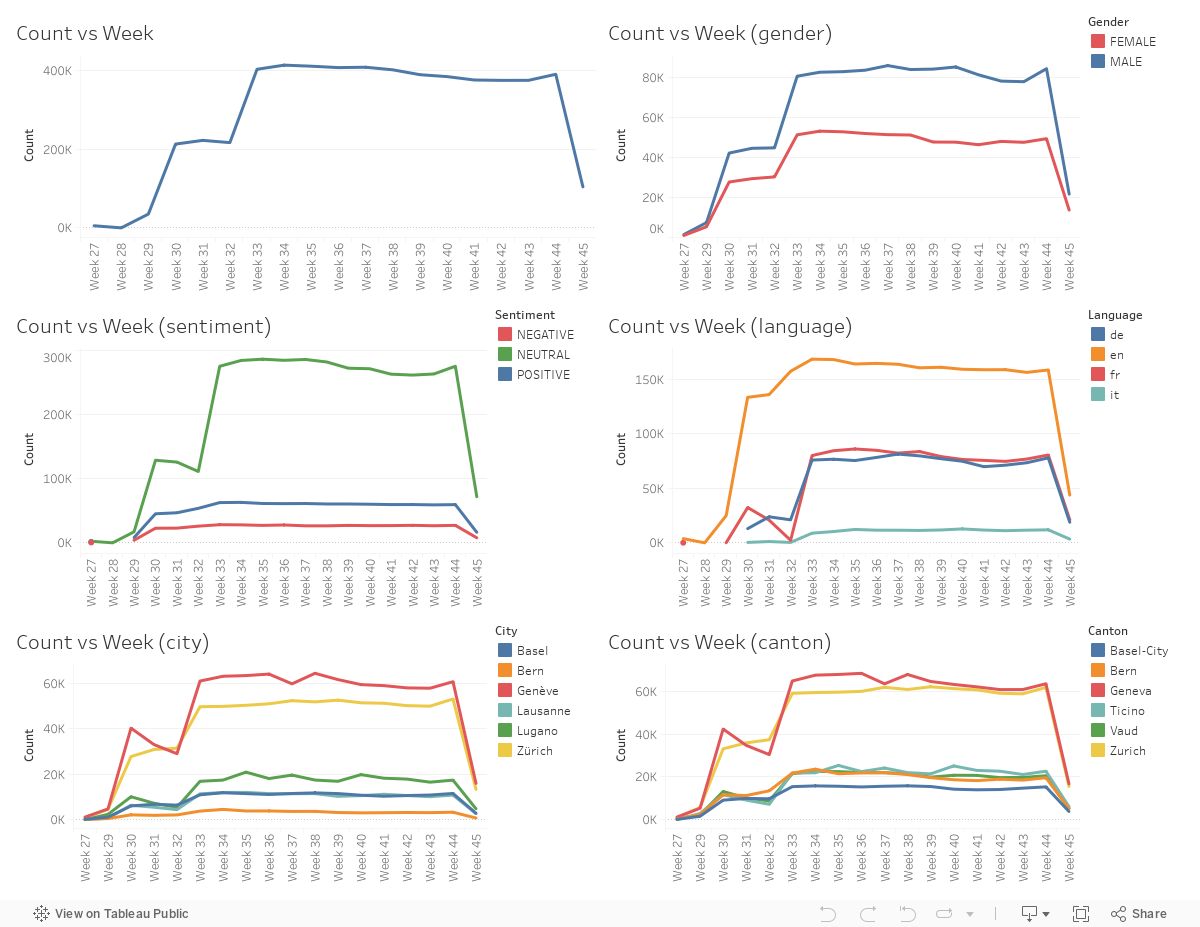
The patterns described above are not different at all, but the data acquisition process can be better understood here. Examining the number of tweets for each week within the timespan of the dataset, one can see that number of tweets are the same during majority of time. At first it stars like around 0 and then increases up to a point and stays the same for 3 weeks. Then once again it increases and stays almost the same up to the end. This suggests that maybe at first only handful of tweets are collected in testing part. Then data acquisition code is run and for 3 weeks tweets are collected. After some time, one computer also starts to collect the data and thus number of tweets acquired almost doubles. This is just one possible explanation concerning the number of total tweets vs week of timespan plot, but indeed a reasonable one. It clearly shows the importance of data exploration before making analysis, otherwise one might think there is a tweeting pattern in time although it is a result of data acquisition process.
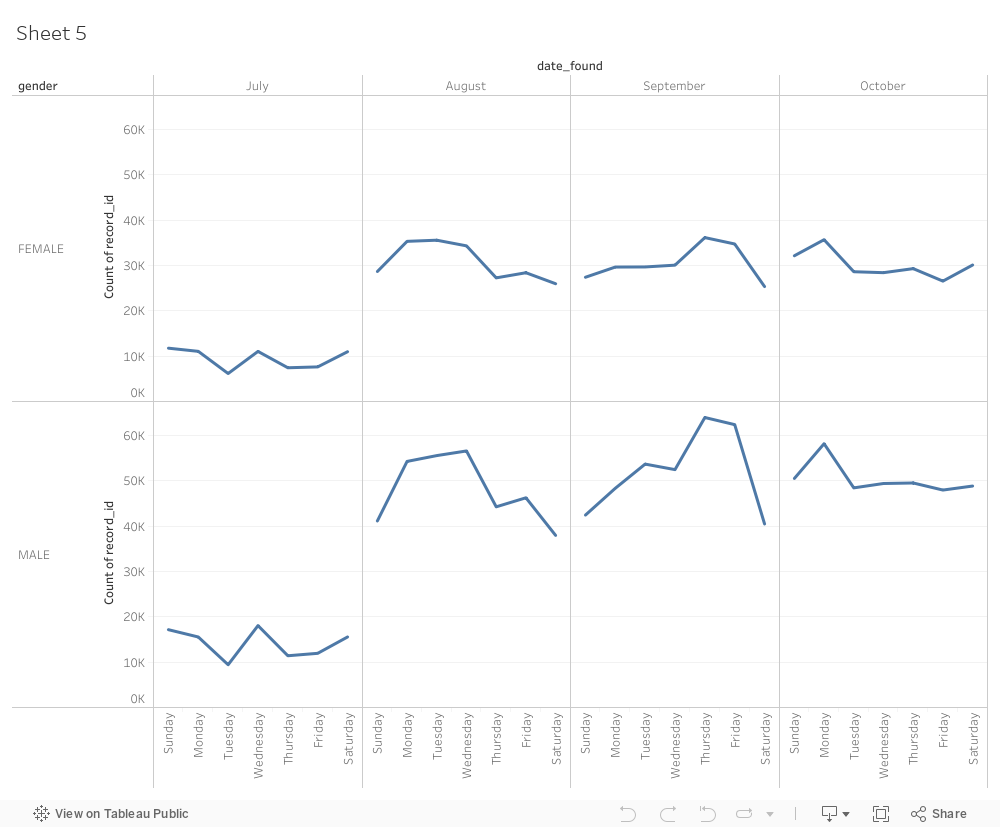
Normally, we would not expect a pattern emerging here as there should not be any preference for people to tweet in any day of the month. Except, there might be regularities because of weekdays / weekends and public holidays. Normally, whn summing for different months, these regularities which are result of sampling should disappear. As we sum up for just 5 months there might the regularities still present. In each plot, number of tweets seems to increase as day of the month increase. That might be result of unintended regularity in those days. More likely explanation would be regularity as a result of sampling process. As we examined before, number of tweets acquired seems to increase during July, which might be the reason behind that increasing like structure in plots below. Also note that, during 15-20 of month there is strange peak in each plot. This might be result of some event that resulted in people tweeting more or again might be result of sampling in data acquisition process. In any case, it is hard to explain such regularities that might not be necessarily indicative of Swiss people's Twitter usage.
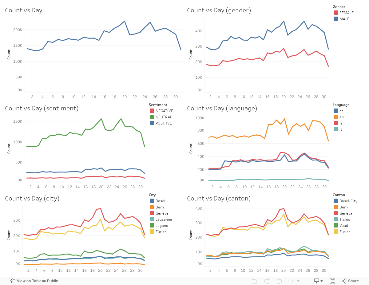
The patterns described above are not different at all, but here patterns during week can be seen clearly. Starting from 8 August, there is a clear sinusoidal like pattern that corresponds to different days of week. We already know what that is, people's Twitter usages are different during weekday and weekend. This is for sure the case after 8 August, as expected. However, before 8 August there is a very noisy and interesting curve which does not seem like intuitive. Other than being possible problem with data acquisition during that time we cannot really understand the patterns occurring from the start up to 8 August. Note that, after 8 August the sinusoidal like pattern concerning the day of the week occurs in all of the plots as expected. The reason is, none of these features should change significantly according to day of the week. In other words, number of tweets with particular feature also reflects weekday and weekend cycle, and people tweet less during weekend as they probably do other fun stuff in their free time.
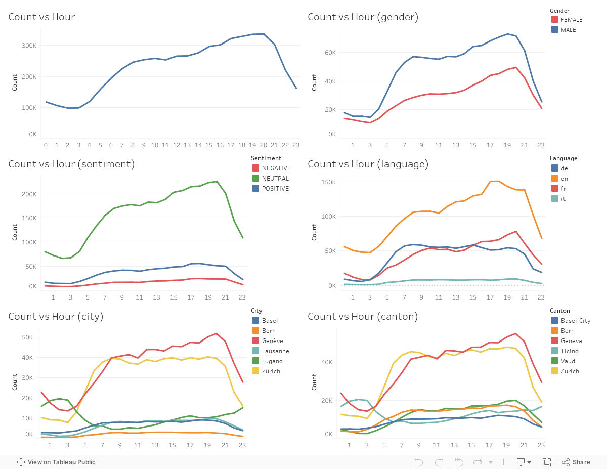
Here we see clear pattern. Starting from 8pm, number of tweets always decrease until 4am, first quickly and then slower. Then, after 4am number of tweets always increase first quickly, then slower, and then again quick increase and peak around 8pm. This clearly reflects day night cycle of people. One can understand day and night as well as pattern during the day. For example, it is worth noting that peak Twitter usage is after shift or school. For both gender, the patterns are similar. But what we see is, during low hours discrepancy between male and female tweet counts are actually very low which means it is the day usage that makes such difference. For tweets with particular sentiment, the patterns are again similar. For neutral tweets it is very clear, but for positive and negative tweets it is not easy to understand the whole pattern by just looking at curve because of low number of tweets the effect does not seem that drastic in the plot. Especially for negative tweets it is hard to see the pattern, but if one zooms into curve for negative tweets (using functionality of Tableau), again the same trend occurs. For tweets with particular language, the patterns are again similar. However, German and English-French does different shapes which is interesting. German starts to increase earlier in morning and stars to decrease earlier in afternoon. Also, the usage is somewhat similar during the whole day, from morning to afternoon. Especially there is no peak around 8pm. On the contrary, for French and English tweets the pattern is more likely what is described as general trend. There is increase after morning, but during afternoon there is another increase which makes a peak around 8pm. These different trends according to language might be indicative of Swiss people's way of life. Especially, the difference between German and French speaking Swiss people might be reflected by trend line of number and time they sent tweets. Note that, for Italian the trend cannot be clearly seen because of low number of Italian tweets compared to other languages. But if one zooms into curve for Italian tweets (using functionality of Tableau), it is again same as French and English. For tweets from particular cities, the patterns are again similar except the case of Lugano. After around 8pm, number of tweets decrease until around 4am. After 4am, number of tweets again increase. For German speaking cities (Basel, Bern, Zürich) the pattern is the same as described for German; and for French speaking cities (Geneva, Lausanne) the pattern is the same as described for French. These difference might be indicative of cultural difference and daily routine of people living in different parts of Switzerland. Considering the cultural difference between German and French speaking parts of the country, it is interesting to see effects of that in number of tweets across day. For Lugano, the peak occurs during night which does not makes sense at all. This might be a result of problem in data acquisition, or there might be bot tweets set from Lugano during night. Or maybe, people from Lugano really like to tweet during night, which is perfectly fine as long as that is what they really want :) For tweets from particular cantons, the patterns are again similar except the case of Ticino (where Lugano is located). Other than the effect of population difference between cities and cantons they are located in, the patterns are similar to what we have seen for the case of plot for cities.