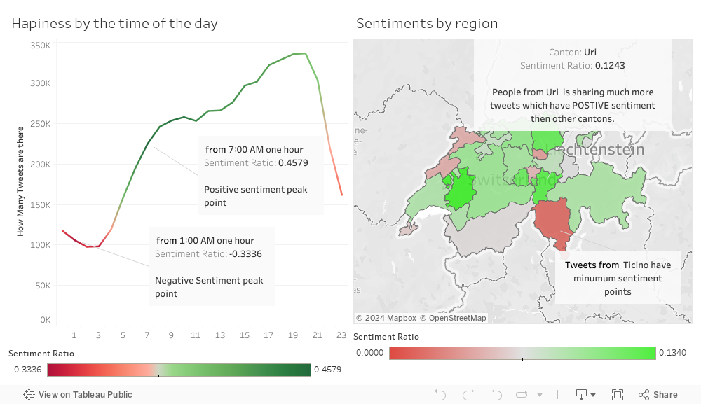
As you can see from the first grap after the midnight Swiss people are more probable to share their negative thoughts. However after the sunrise they are in their positive peak point. ( In the visualization it says 7:00 PM but in should be AM )
In the second graph we have tried to visualize emotional differences in between cantons. And as it clearly shown Ticino have the least sentiment point where Uri and Fribourg has the most positive sentiment tweets.
By this way, we are trying to answer these question:
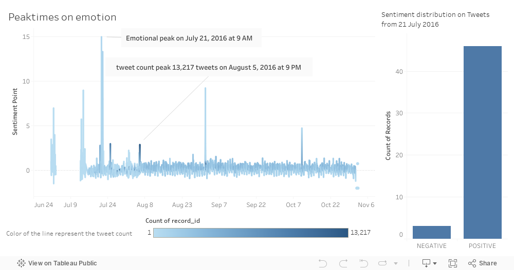
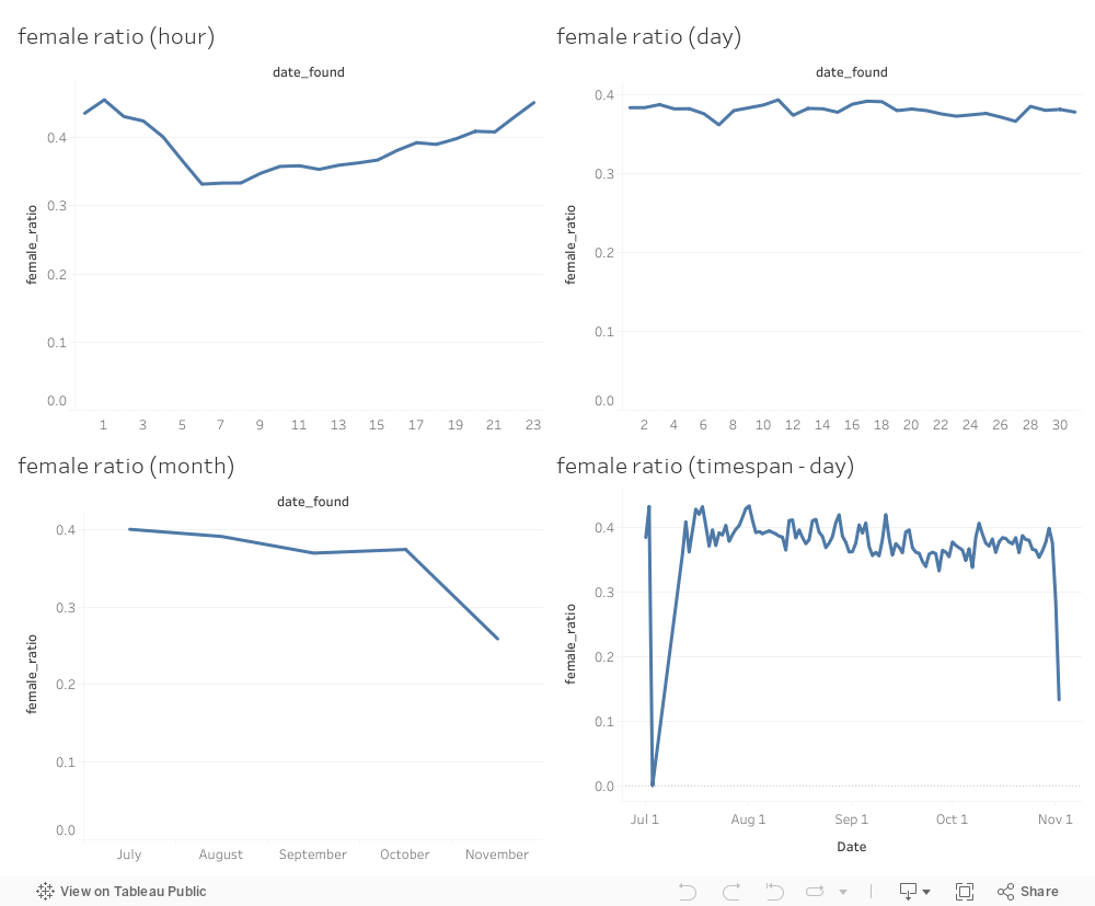
As you can see from the first graph, 21.07.2016, 1.09.2016, 10.10.2016 are special days for the Swiss people. During these days there is some soccer success of Swiss National Team, and some olympic success(summer). But we are not sure the real reason of these occurrence.
By this way, we are trying to answer these question:

As you can see from the map and pie charts, English are as popular as official languages. Be aware that this graph is city based not the region. (To be a part of the pie charts tweet counts ot that language must be more then 1000, because of this some cities are shown as pure circle.)
By this way, we are trying to answer these question: